v1.3.0
Use with AI Figma

Breadfast Design System

Base Components UI Library Reference

Use with AI

Build screens instantly with Claude, Codex, or Antigravity. Paste this context URL into your AI tool:

https://ui.breadfast.app/ai-context.md

Or clone the repo for Claude Code (CLAUDE.md auto-loads) · Copy compact prompt

Colors

Core color palette extracted from the Breadfast Design System (Figma).

Brand (Primary)

Primary #AA0082
Dark #9C0062
Darker #7C0E52
Light #FBB3E1
Lighter #FFD6E8
Lightest #FFF0F7

Success

Success #108723
Dark #0E6027
Light #6FDC8C
Lightest #E8FFED

Error

Error #DA1E28
Dark #A2191F
Light #FFB3B8
Lightest #FFF1F1

Warning

Warning #BA4E00
Light #FFB784
Lightest #FFF2E8

Progress (Info)

Progress #0F62FE
Light #A6C8FF
Lightest #EDF5FF

Text

Default #212121
Secondary #6F6F6F
Tertiary #B7B7B7
Disabled #D8D8D8

Background

Default #FFFFFF
Secondary #F3F4F5
Tertiary #EBEBEB
Brand #FFF0F7
Dark #212121

Interaction States

Primary Default #AA0082
Primary Pressed #9C0062
Primary Disabled #D8D8D8
Secondary Default #FFF0F7
Secondary Pressed #FFD6E8

Typography

Font: Faro (Lucky variants). Supports EN and AR with localization variables.

Display

.text-display-lg 96px / 100px w800
Display Large
.text-display-md 52px / 56px w700
Display Medium
.text-display-sm 44px / 48px w700
Display Small
.text-display-xs 36px / 40px w800
Display X Small

Heading

.text-heading-xxl 40px / 52px
Heading XX Large
.text-heading-xl 36px / 44px
Heading X Large
.text-heading-lg 32px / 40px
Heading Large
.text-heading-md 28px / 36px
Heading Medium
.text-heading-sm 24px / 32px
Heading Small
.text-heading-xs 20px / 28px
Heading X Small

Label

.text-label-lg 18px / 24px w600
Label Large — Semibold
.text-label-md 16px / 20px
Label Medium — Semibold
.text-label-sm 14px / 16px
Label Small — Semibold
.text-label-xs 12px / 16px
Label X Small — Semibold

Paragraph

.text-paragraph-xxl 28px / 40px w400
Paragraph XX Large
.text-paragraph-lg 18px / 28px
Paragraph Large — Regular weight for body text.
.text-paragraph-md 16px / 24px
Paragraph Medium — Default body text size for most content.
.text-paragraph-sm 14px / 20px
Paragraph Small — For secondary information and captions.
.text-paragraph-xs 12px / 18px
Paragraph X Small — Footnotes and fine print.

Pricing

.text-price-numeric-lg 40px / 52px
1,234.99
.text-price-numeric-md 32px / 40px
567.50
.text-price-numeric-sm 20px / 28px
89.00

Spacing & Radius

Consistent spacing scale and border radius tokens.

Border Radius

0
4px
8px
12px
16px
20px
full

Spacing Scale

4px
1
8px
2
12px
3
16px
4
24px
6
32px
8
48px
12
64px
16

Icons

29 icons extracted from the Figma Design System (node 1959:6567). All icons use fill: currentColor and inherit their parent's text color.

Sizes

Figma defines 4 sizes: Small (16px), Medium (20px), Large (24px, default), X-Large (32px).

16px
.icon-sm
20px
.icon-md
24px
.icon (default)
32px
.icon-xl

Icon Gallery (29 icons)

home-outline
home-filled
search-outline
search-filled
cart-default
cart-filled
pay
more
add
minus
close-outline
checkmark-circle
checkmark-circle-filled
chevron-left
chevron-right
dropdown
alert-circle
alert
info
bell
heart
heart-filled
star
delete
settings
location-pin
navigate
loading (spin)
activity-history

Buttons

All button variants, sizes, and states.

Variants

Sizes

States

Full Width

Field Inputs

Form controls for text, selections, and user input.

Floating Label — Default (Empty)

We'll never share your email.

Floating Label — Filled (Inactive)

Error State

Please enter a valid phone number.

Success State

Code applied! 20% off your order.

Disabled

Sizes

Select

Textarea

Checkbox & Radio


Top App Header

Top navigation/header component from the Breadfast app shell. The library now follows the Figma documentation API for size, localization, clickable title, optional leading icon, one to three trailing icons, optional status bar, and optional subtitle.

Centered / EN / 1 trailing icon

Title here

Centered / AR / 1 trailing icon

اسم الصفحة هنا

Small / EN / 2 trailing icons

Title here

Small / AR / 2 trailing icons

اسم الصفحة هنا

Large / EN / subtitle on

Title here

Subtitle here

Large / AR / subtitle on

اسم الصفحة هنا

عنوان فرعي هنا

Clickable Title / EN

Title here

Clickable Title / AR

اسم الصفحة هنا

Product Card

Compact merchandising card from the Figma design system. Supports grid and horizontal-scroll containers, add and notify actions, quantity stepper, variants pill, and loading state.

Badge Variants

Sponsored 2x Points Sold out Discount Success New

Grid

New
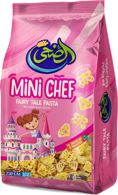
Mini Chef pasta
10 .00

Name/description here for max. 3 lines then truncate the rest of the name.

New
Mini Chef pasta
1
10 .00

Name/description here for max. 3 lines then truncate the rest of the name.

Discount
Mini Chef pasta
2
10 .00

Name/description here for max. 3 lines then truncate the rest of the name.

Sold out
Mini Chef pasta
10 .00

Name/description here for max. 3 lines then truncate the rest of the name.

Success
Mini Chef pasta
10 .00

Name/description here for max. 3 lines then truncate the rest of the name.

Horizontal Scroll

New
Mini Chef pasta
10 .00

Name/description here for max. 3 lines then truncate the rest of the name.

2x Points
Mini Chef pasta
1
10 .00

Name/description here for max. 3 lines then truncate the rest of the name.

Discount
Mini Chef pasta
2
10 .00

Name/description here for max. 3 lines then truncate the rest of the name.

Sold out
Mini Chef pasta
10 .00

Name/description here for max. 3 lines then truncate the rest of the name.

Sponsored
Mini Chef pasta
10 .00

Name/description here for max. 3 lines then truncate the rest of the name.

+More

Toast / Snack Bar

Single-line notification bars. 44px height, 8px radius, no border. Layout: [icon] [message] [action button]. Figma node 1915:6491.

Error

Message written here.

Success

Message written here.

Warning

Message written here.

Informative Dark

Message written here.

Informative Light

Message written here.

Informative Magenta (Brand)

Message written here.

Tab Bar

Bottom navigation tab bar from Figma (node 7808:395). Supports LTR and RTL layouts with active/inactive states.

Default (LTR — Home active)